
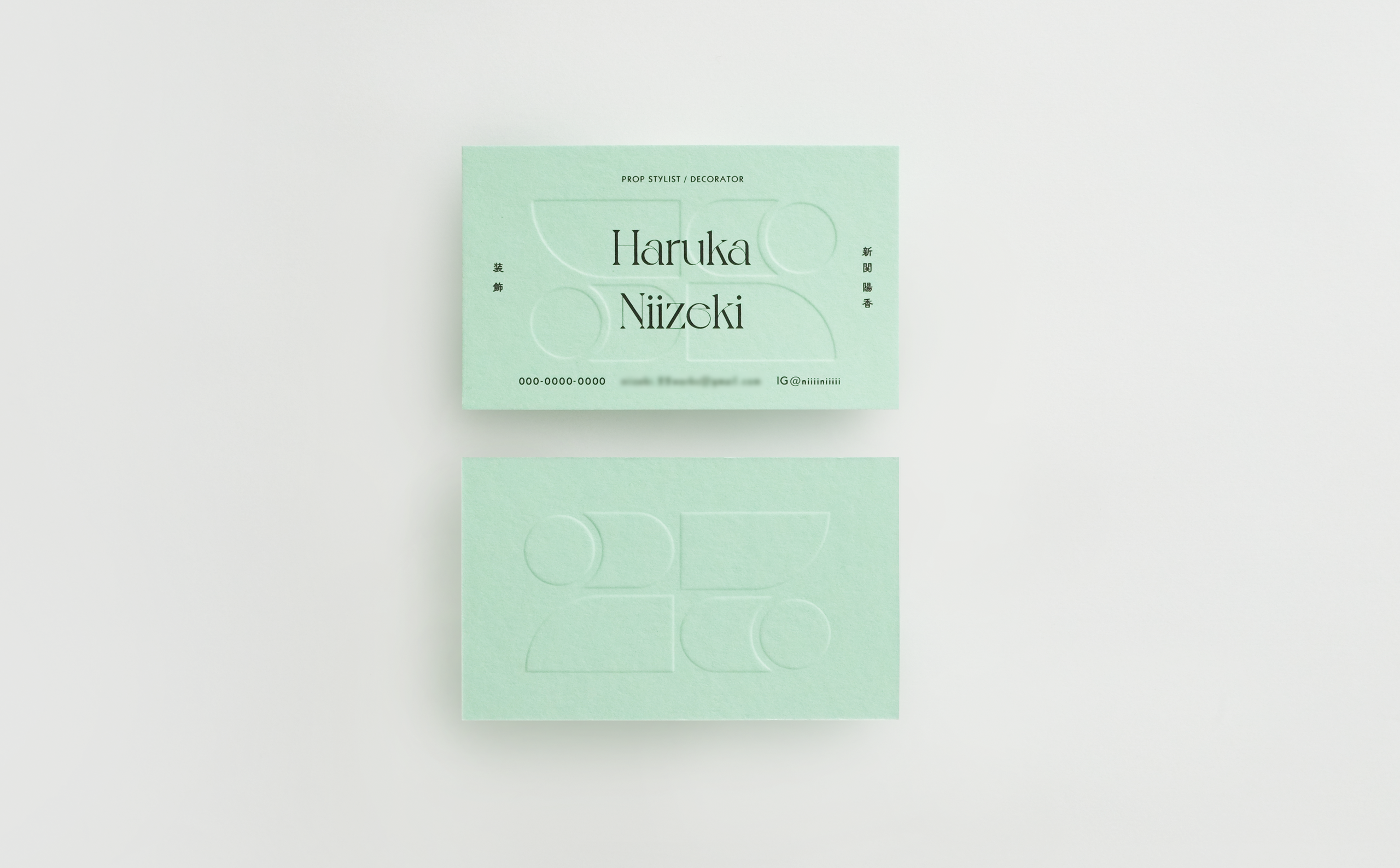
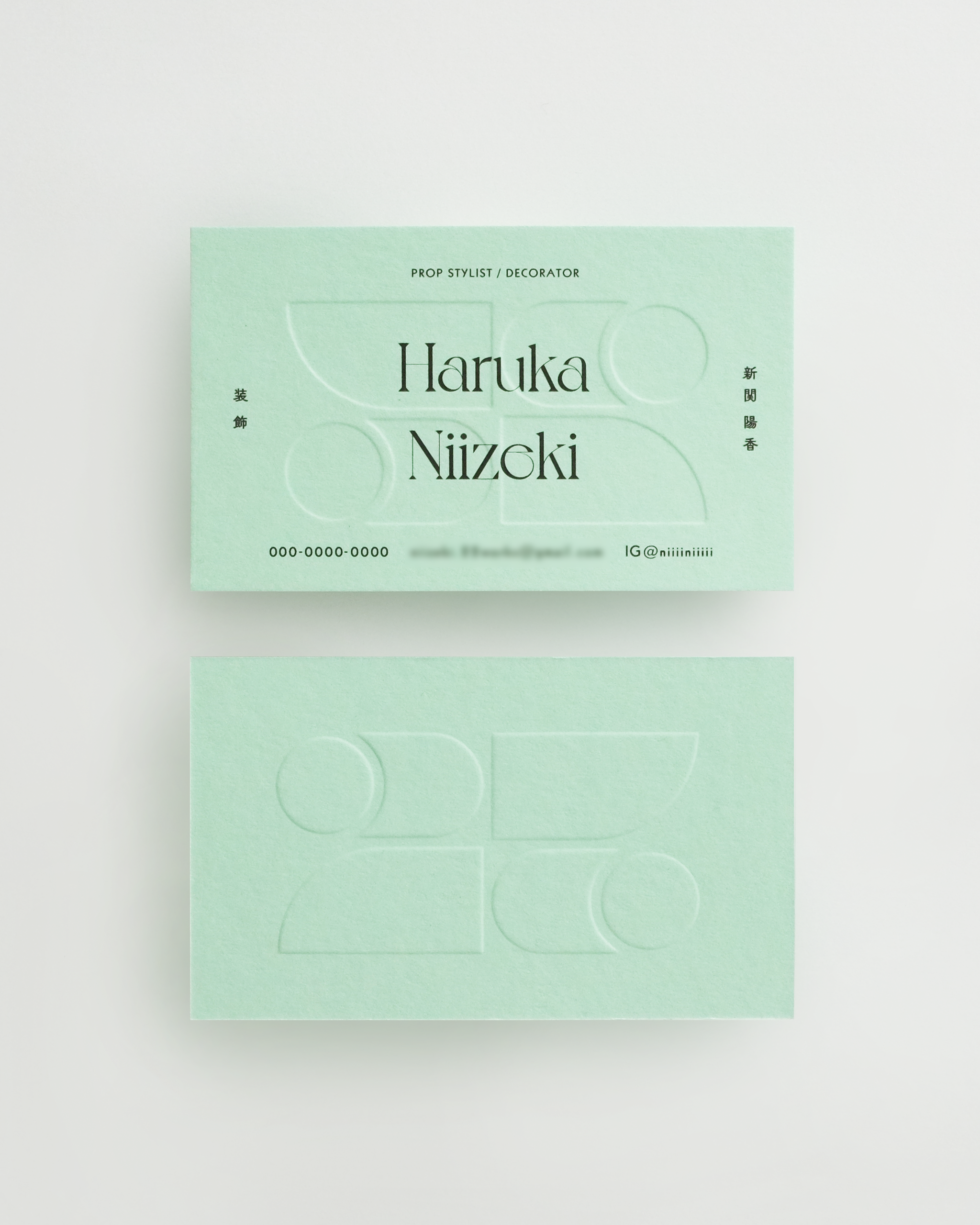
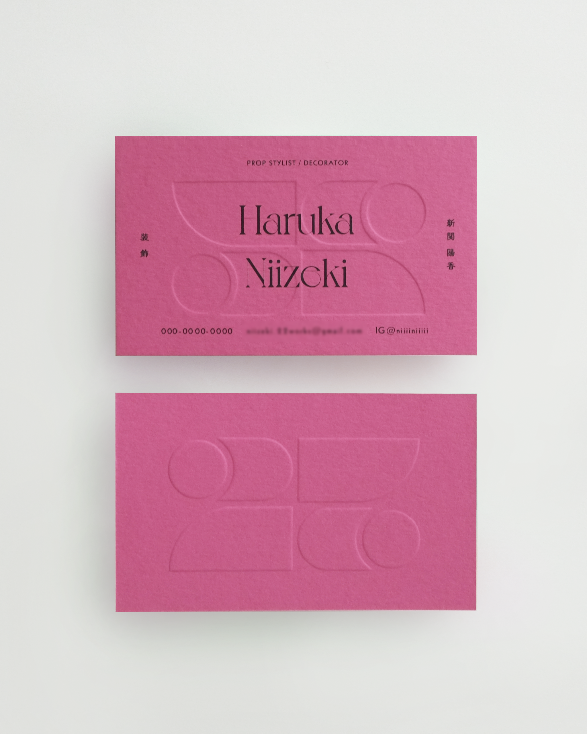
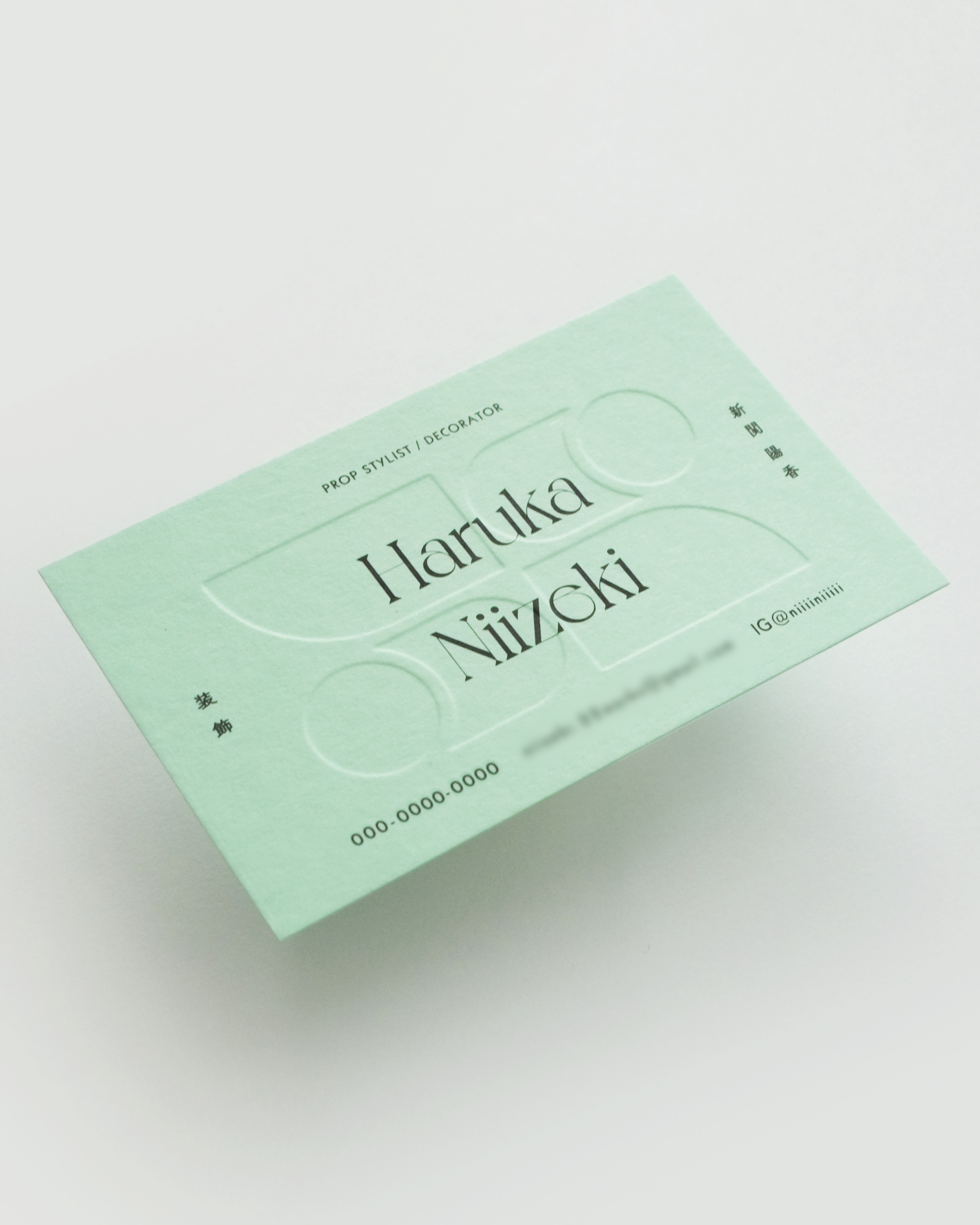
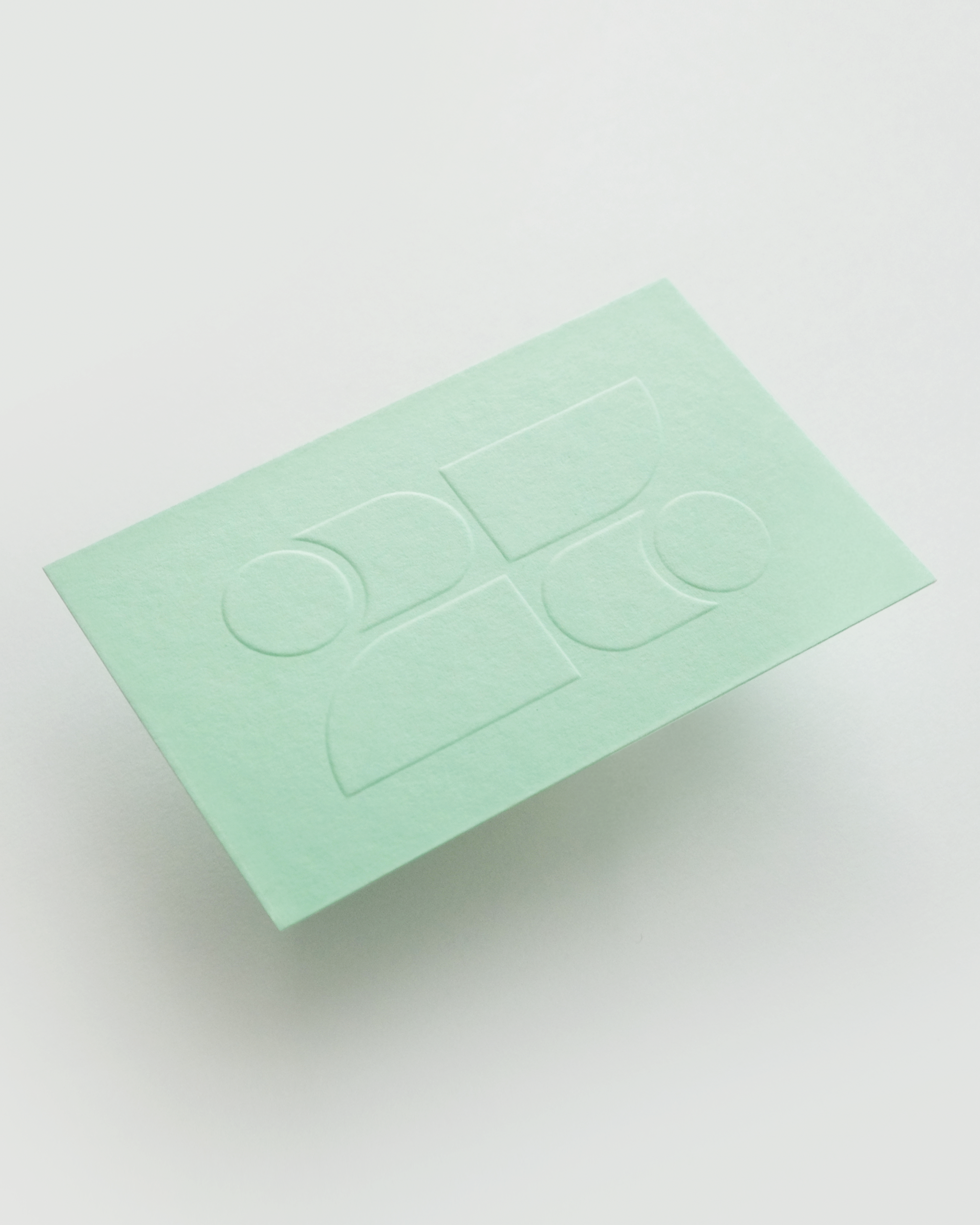
フリーランスのプロップスタイリスト/美術として活動する新関はるかさんの名刺をデザインさせて頂きました。
彼女のデコレーションやスタイリングは、ポップで明るいものが多い一方で、一つひとつのプロップを自らの手でつくり上げる繊細さも持ち合わせています。今回の名刺では、そんな彼女の素敵な一面を表現したいと考えました。
名刺の裏面に使用したロゴモチーフの「2」は、彼女の屋号「22works.」の「22」を表しています。これは、彼女の苗字の「Niizeki(新関)」の「Ni(ニ)」が、英語の「2(two)」と同じ音であることに由来しています。そこで、2つの「2」をそのまま並べるのではなく、反転させて組み合わせることで、より豊かでクリエイティブなイメージを生み出したいと考えました。
氏名のタイポグラフィには、以前から使ってみたいと思っていた、パリのタイプフェイススタジオ「VJ TYPE」の書体を使用しています。その華やかさとシャープさが、彼女自身や彼女の仕事と非常に相性が良いと考え、この書体を選びました。また、その日の気分や、名刺を渡す相手に合わせて異なる色を楽しみながら使ってもらえたら…という思いから、複数の種類の紙の中からクライアントが特に気に入っていた2色、グリーンとピンクを選び、印刷を行いました。
The client of this business card is Haruka Niizeki, a freelance prop stylist and decorator.
Her decorations and styling are often pop and bright, but she also has the delicacy to create each prop with her own hands. We wanted to express this wonderful side of her on her business cards.
The number “2” that is the motif of the logo on the back of the business card represents the “22” of her own trade name “22works. (The “ni” in her last name “Niizeki” is pronounced the same as the English “2”). Therefore, we wanted to give her a richer and more creative image by inverting the two, rather than putting them together as they are. The typography used for her name is from VJ TYPE a Parisian typeface studio that I had always wanted to use. We used this typeface because we thought its flamboyance and sharpness would be highly compatible with herself and her work. And, From several types of paper, I chose two of the client’s favorite colors (green and pink). That is, I wanted the client to enjoy using different colors depending on her mood and the person to whom she gives the business card.